Graphic design’s invasion
Graphic design’s invasion into fine art, film, photography and more
Andy Cooke, creative director at studio Weather, runs us through his new book Graphic Design For, which explores graphics’ impact on everything in the world around us.
Graphic design permeates everything around us, from the signage, symbols and typography gracing pubic transport networks through to the packaging and branding used to sell the products we see and buy every day.
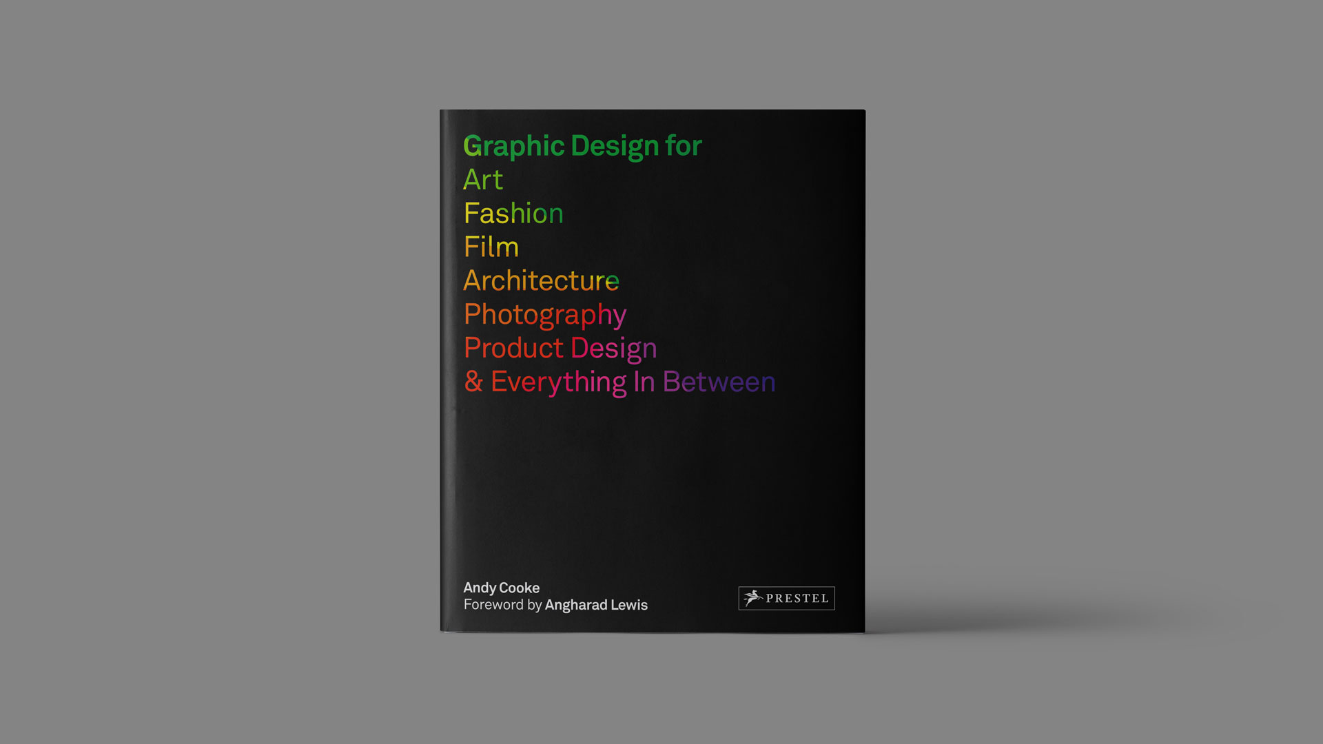
A new book hopes to celebrate and showcase just how universal graphics are. Graphic Design For Art, Fashion, Film, Architecture, Photography, Product Design and Everything In Between, published by Prestel in March, is an all-encompassing look at the influence of the field, split up into seven, thematic chapters.
Written by Andy Cooke, a graphic designer and creative director at studio Weather, the book explores such graphics-led projects as Studio Makgill’s striking, monochrome look for the pop-up retail chain BoxPark through to Berlin-based studio Hort’s campaign for Nike, and a colourful visual identity project for G. F. Smith, which brought the paper printers to life.
Cooke picks out the most important example from each chapter in his new book – art, fashion, film, architecture, photography, product design and everything in between – and explains why they were such important and forward-thinking projects.
Art
“Art is perhaps one of the most coveted creative disciplines by graphic designers — there is an abstraction and freedom in the field that is seldom seen in other sectors. This project is a long-time favourite of mine, ever since I visited the museum five years ago. The combination of utilising a flexible identity system and applying that (often) corporate thinking into an art setting is a prime example of how graphic design is a huge asset to the creative industries. Even in art, where often graphic output is produced by the artists themselves (as they are generally savvy), this is evidence that a considered and commercial approach to brand is paramount.”
Fashion
“Fashion, by definition, is trend-led — and often, so is graphic design. Graphic designers are very sensitive to trends, with many calling them out as an unreliable approach to design — but when studios like Hort are the ones leading and setting those trends, how does that play out? This project, for an organisation that I’ve always wanted to work with, is trend-led but at the forefront of it. Consumers are not as sensitive to trends as designers are, and therefore there’s a licence to embrace them for projects such as this. It’s a perfect example of using ‘what’s in’ to stay relevant, and I love the bravery in that thinking.”
Film
“Graphic designers can often get wrapped up in what they create, rather than the ultimate purpose. The new logo, combined with a typographic system, conceptual colour palette and a trophy idea can overpower the content of who they’re working for. This is an easy trap to fall into with film (as well as photography), unless the content is put at the forefront.
I love that the Storyline identity does this, embracing photographic settings combined with colour palettes to produce a really viable set of identity visuals that directly relate to the company. The trophy doesn’t overpower either, resulting in a really well-balanced piece. Capturing the drama of film in an identity that needs to exist across static touchpoints can be difficult, so Work In Progress do well to achieve it. Designers should consider this type of thinking when working with moving image organisations.”
Architecture
“In my introduction to this chapter, I talk about how graphic designers tend to have a fascination with architecture. Brutalism in particular feeds this fascination. This is strange, given designers’ objection to trends, as I mentioned earlier – this particular wave design signifies a very distinct moment in time and it could be argued that it is a trend in itself. Regardless, This Brutal House bridges the gap between graphic design and architecture, marrying the two worlds in beautifully crafted concepts and visuals, shining a fresh light on this era of physical design and arguably being responsible for the recent tide of interest in Brutalism on the whole.”
Photography
“It’s not usual for huge names in other artistic disciplines to embrace graphic design in framing their craft, however Rankin chose to launch the incredible publication Hunger, which does just that. It is perfect to marry visuals across photography and graphic design in a printed format; a format that many seem to view as irrelevant and in decline, yet this magazine has proved to those naysayers that print is alive, kicking and will continue to be a primary source for people to interact with design, photography and written content for years to come. As with the nature of the featured content, the design has stayed ahead with the fashion of the time since its inception, often pushing boundaries and breaking conventions.”
Product Design
“Alex Swain’s experience working in graphics, prior to his foray into product design, is clearly seen in his work. This is perhaps why I’ve been drawn to many of his creations over the years. This direct graphic influence has also been seen in other products recently, such as the serif TV from Samsung, showing that graphic design has a strong role to play in not just the packaging for products or in selling them — but as part of the products themselves.”
Everything In Between
“Printworks is a huge, cultural events space in London, hosting events in music, food, fashion, art, film, theatre and more. In the current social and political landscape, there is a general opinion that culture and creativity are less important than more ‘academic’ activities, particularly within schools. Venues such as Printworks aren’t as abundant as they should be, especially considering the scale of the organisation.
Taking into account its diverse offering as an institution of culture, the identity strikes the perfect balance between empowering what Printworks entails and enhancing it, set against a distinctive brand voice. This is always tricky in broad cultural settings, as it can be with the art world; a voice that’s too corporate or commercial doesn’t communicate well to the core audience.”
By Sarah Dawood
Ref: www.designweek.co.uk