This Brand Identity Spins Like A Slot Machine To Create Countless Permutations
And every combination is a winner.
Keeping pace with digital technology's constant evolution is no easy feat. For brands that need to ensure their visual identity reads consistently on desktop, mobile, social media, and whatever platform comes next, versatility is essential. Graphic artists Craig & Karl tapped into that mindset in their identity for Folk—a Finnish content-funding platform—which is based on whimsical, mismatched letterforms that spin like a slot machine, revealing countless permutations.
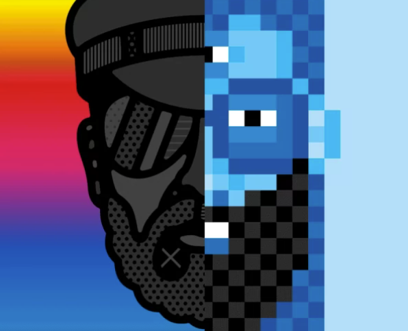
The wordmark and illustrations are done up in Craig & Karl's raucous, exuberant style. The duo has a knack for the art of collage—these portraits, for example—and the concept of randomly revolving letters that work in infinite permutations adds a degree of future- proofing.
"Having a constantly changing identity allows the platform to have a fresh face every time you see it, why should a brand always look exactly the same?" Craig Redman says. "We aimed to establish the identity through color and proportion rather than a set logotype—for example, all the letterforms are individually designed to fit into a specific grid so that any combination will work together and this allows the identity to keep a visual consistency. In addition we kept the same color palette across the whole package, so that even though the letterforms of Folk will change the overall identity will still read as being part of the same brand."
Identities that are poised for constant reinvention are the branding conceit du jour. Google's Doodles, for example,regularly change and when they do, they feel fresh and exciting. Likewise, Craig & Karl's identity can refresh regularly, but instead of needing custom (read: expensive) illustrations each time the company wants to switch things up, the identity relies on randomly generated sequences. "It's terribly cliched but in today's environment everything changes constantly and the audience—and our—attention span is short," Redman says. "The Folk user skews young so we wanted to inject a sense of playfulness into the branding, having an identity that changes all the time is fun and hopefully entices the viewer to learn more about the project."
Nevertheless, a dynamic identity carries risks. In 2011, the MIT Media Lab experimented with a constantly morphing algorithmic logo, but the shapeshifting identity caused confusion, so the Media Lab enlisted Pentagram partner Michael Bierut to give the organization a more consistent look.
Craig & Karl's identity probably won't fall prey to the same problems because the graphics are so punchy—there's no mistaking them for another brand, unlike MIT's formerly amorphous color swatches. But, just like actual slot machines, the novelty can always wear off.