Is This New York City Office the Future of the Workplace?
As the office undergoes a post-pandemic reimagining, Architecture Plus Information conceptualizes a vibrant “clubhouse” to entice workers back.
WHAT DOES WORK LOOK LIKE IN 2023? Think pieces aside, evidence says that the era of the standard office has ended. According to Gallup, 45 percent of full-time employees in the United States worked from home all or part-time in 2021, with JLL showing that up to 60 percent of workers prefer a hybrid model. And coaxing employees in creative white-collar fields back to the office now requires much more than just foosball tables and kombucha on tap. But what if the future workplace could be a generative space that fosters creativity rather than simply containing it?
This was the idea behind global advertising giant Publicis Groupe’s push to conceptualize Le Truc, a unique creative collective nestled inside its sprawling, neo-Brutalist headquarters in the SoHo neighborhood of New York City. Le Truc (“the thing” in French) references the elusive spark of innovation, and the brand conceptualized it to challenge the traditional agency model by recruiting and harnessing talent from across Publicis’s 100,000-strong team to join a powerful “clubhouse” for creatives. Le Truc needed to look and feel like a new kind of workspace, so the team recruited Architecture Plus Information (A+I), responsible for the cutting-edge headquarters of “disruptive” companies like Squarespace and Peloton, to draft an incubator for ideas. But rather than disrupt, Le Truc would need to attract—and give those top-performing workers a reason to spend time within its walls voluntarily.
 Central to Le Truc’s design are an anti-hierarchical ethos and the understanding that work no longer happens at conventional workstations. In fact, the space features fewer than 90 desks for an estimated staff of 250. Instead, workers make use of team rooms, phone booths, sofas, and other spaces as their needs and activities change.
A Corrective to the Pre-Pandemic Office
“Le Truc can be viewed as a corrective to the pre-pandemic office,” says Peter Lowell Knutson, chief strategy officer at A+I. “Our vision was to confront easy categorization about what a given space is meant to do and let the user make the space they need when they need it.” Streamlining the basic concept of an office down to its barest essence via a floor plan of interconnected open spaces for meetings and semi-secluded areas for brainstorming and deep work, the space is fluid and egalitarian, eschewing private offices and break rooms in favor of space that promotes spontaneous interaction.
When you arrive at the 15th floor of Publicis Groupe’s 375 Hudson Street building, there is no formal signage or reception introducing Le Truc. Instead, you enter through a simple Sheetrock entryway, ribbed with an almost lenticular system with a gradient that transforms from purple to orange. The cumulative effect is dramatic—a portal between the standard offices that surround it and the vibrant world of Le Truc. “It’s a transformation. It’s not your home. It’s almost this spaceship,” joked Knutson during our walk-through. “It sets you apart from where you’ve been, puts you in a different mindset.”
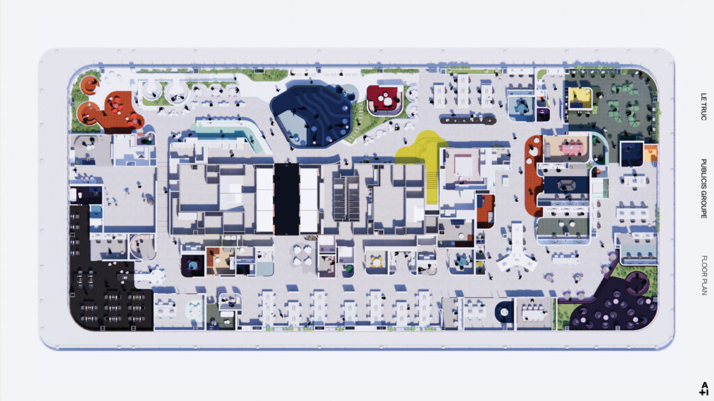 Le Truc’s floor plan is anchored by colorful collaboration zones in the corners with small areas for team meetings and a handful of workstations spread throughout. A zigzagging hallway weaves it all together, creating a sense of discovery as workers move through the office. COURTESY A+I
Colorful Nooks and Tech-Free Zones
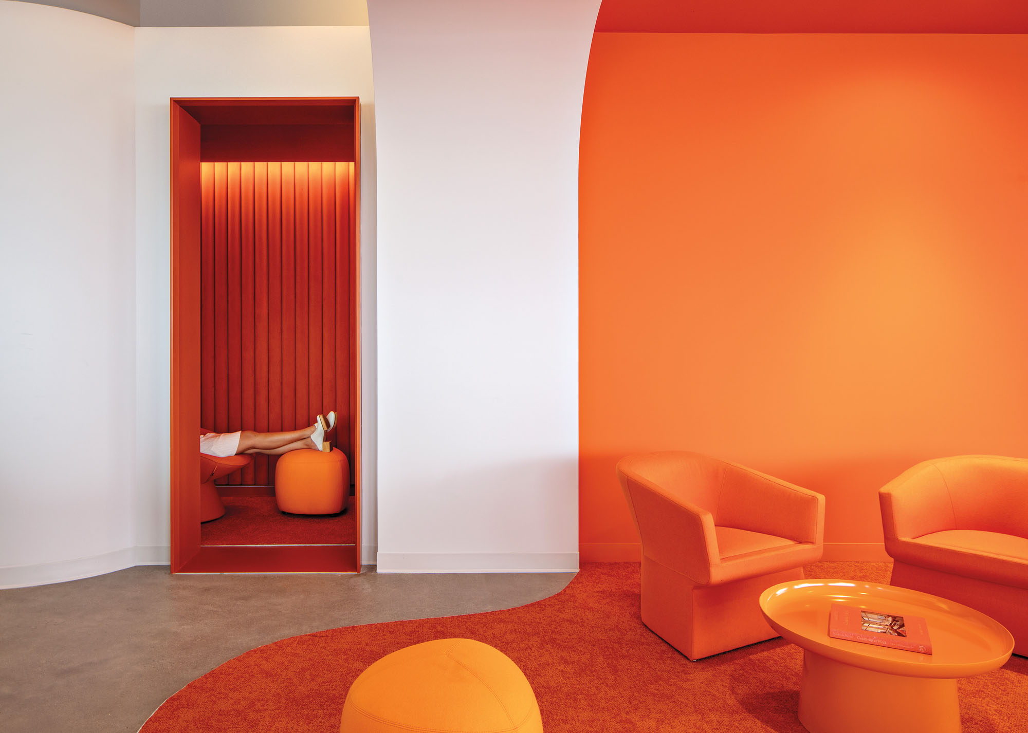
Once inside, you are greeted by a neutral color palette that’s punctuated by a fruit bowl of color-themed nooks and spaces, from a citrine-hued breakout room to the soft strawberry tones of a carpeted, tech-free meeting area known as the Tearoom. Visitors pass through the main pantry and coffee area to a modish, tangerine-hued sitting area and meeting space with sunken lounges that are outfitted with circular tables and booths. “Playing with different level changes allows you to experience the space differently, especially when you descend into a conversation,” says Knutson, who has a background in neuroscience. “The intent was that some would like this, some would hate it, but it would be different,” he said, noting that the added levels create a separate vertical barrier allowing for the feeling of being “alone even in a big, busy space.”
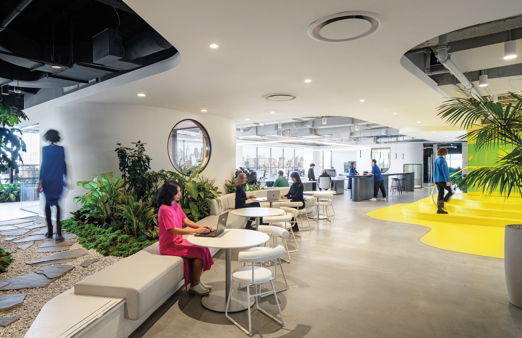
The lounges organically extend into a snaked seating area lined with curated greenery and bathed in natural light by a wall of floor-to-ceiling windows overlooking the Hudson River. Following the perimeter, a communal table hugs the inner ledge, providing additional seating and a popular space for lunch breaks and midday inspiration. “Each space is designed to adapt and respond to the ways employees have chosen to work, rather than structure them in spaces that can stifle movement or creativity,” Knutson continues. “This whole floor is designed for creatives, to inspire, challenge, and shake them out of their day-to-day.”
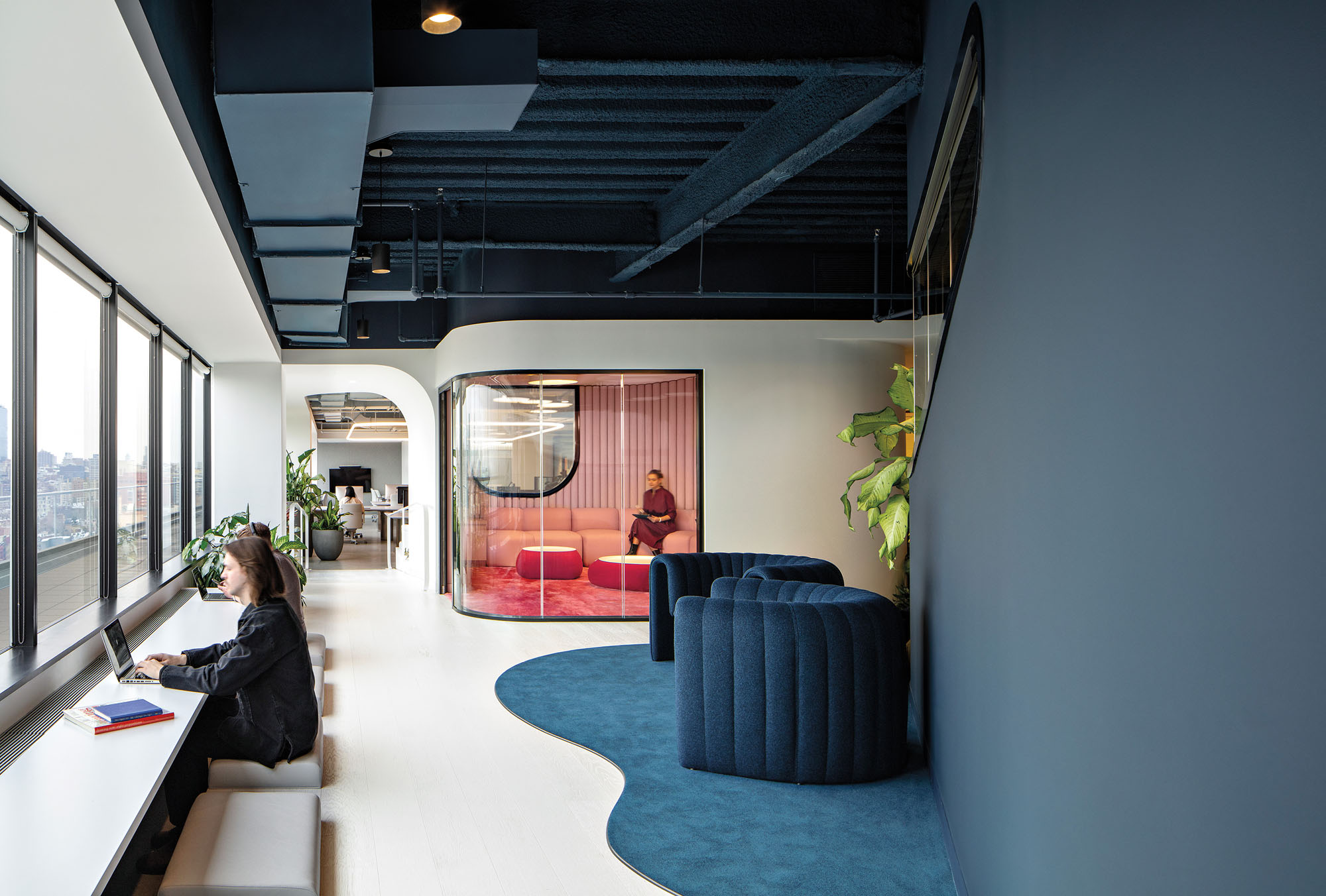
Drawing Employees Back with a Culture of Sharing
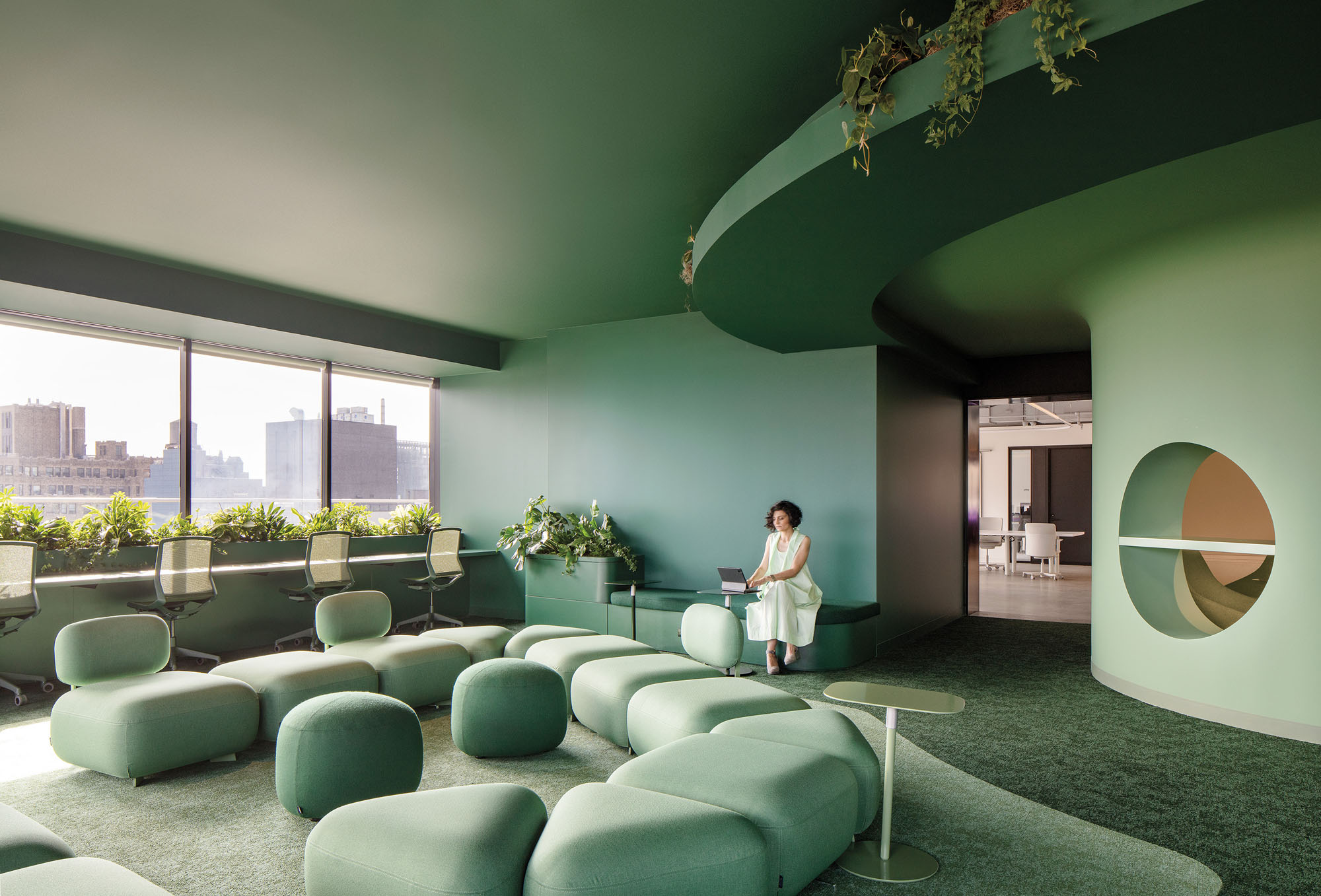
Farther into the floor plan is a navy-tinged, sunken presentation room dubbed the Dugout, which does triple duty as a screening theater, presentation area, and brainstorming space. Fringing this enclave are off-white workstations and additional study areas—none with assigned seating. “The assumption is that work doesn’t happen at workstations,” says Knutson. “It happens on the sofa, or on the floor in the orange room,” he says, referencing another citrus-inspired lounge area. He also notes that each “teaming zone,” of which there are many for Le Truc’s employees, is structured to prepare groups for creative tasks and is equipped with a whiteboard space, phone booths, and additional conference rooms to huddle and brainstorm in. The workspace follows into a lush, evergreen-colored Library,” which provides the most significant communal quiet space. “They recognized what they were missing in an office space,” says
Philip Ryan Ward, studio director at A+I and an originator of Le Truc’s design. He explains that since most of the lab participants would be hesitant to return to the office five days a week, there would need to be an added incentive. “Most of them come here for the culture, the creative sharing."
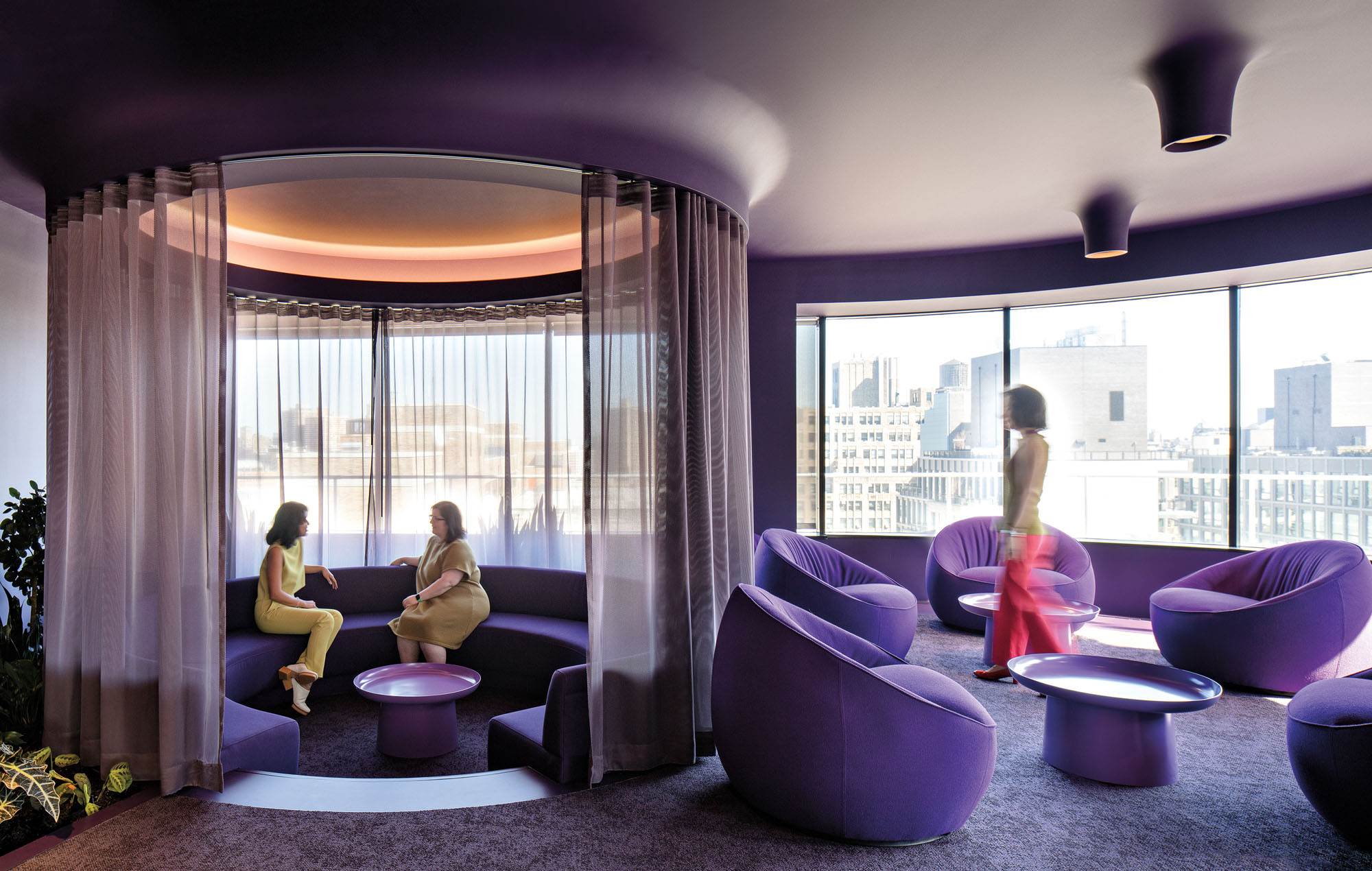 Starting from the premise that work no longer takes place at traditional desks, A+I provided a wide variety of unique seating options such as a funky purple conversation pit to inspire and delight the creatives who use Le Truc.
Drawing Inspiration from Covid-Era Pop Ups
Much of Le Truc was completed during the pandemic, and the design took inspiration from the pop-up spaces for outdoor dining and open-air performances that proliferated across the city during those years. Since the concept of Le Truc was new, there was room to experiment and run focus groups. “We worked hard at the front end to understand and then represent to the client the story of who they were and what that meant for the space,” says Knutson. “Understanding these elements required learning how the team preferred to sit, share, and create and how relationships were reinforced. This space is all about building a container for relationships.”
Throughout Le Truc, several office spaces are named for monsters—Gollum, Count Dracula, and Falkor, for example. The team insists that these are “happy monsters” and permutations of “The Thing”—that all-consuming passion that drives creatives to bring their ideas to life. “We realized we needed to break the system so the design wouldn’t feel expected,” say Knutson and Ward, explaining why they chose twists like big open areas next to neon-washed enclaves. They realized that though the flow of the space needed to be simple, they wanted to outfit the office with enough weird turns that there is a sense of discovery, allowing for a space that commands attention and encourages exploration.
Written By: Laura Feinstein
Photography: Magda Biernat
Source: Metropolis
