Is the logo still important?

What’s in a brand? Paul Bailey, strategy director at We Launch, argues that a company’s character is made up of so much more than its logo, from its sound to its app icon.
People don’t really care about logos anymore, do they? Well, over 18,000 page views might tell a different story.
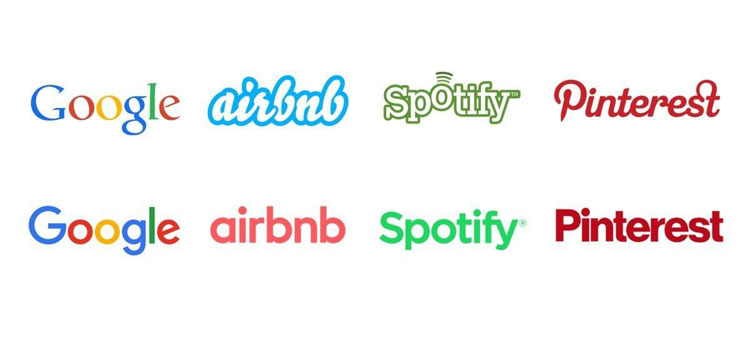
I recently shared a post on LinkedIn, which showed the changes to four leading brands’ logos – Google, Airbnb, Spotify and Pinterest – which had previously been shared on Twitter by Oh No Type Company.
The recent rebrands of all these companies seemingly followed a trend of moving from characterful to clean, sans-serif styles. I compared this trend to 1960s corporate America, which reminded me of an article in the Guardian in 2014 on Helvetica’s use in that era.
It described the corporate branding world using the typeface like a “high-pressure hose, blasting away the preceding decades of cursive scripts, pictorial logos, excitable exclamation marks and general typographical chaos” and replacing all this with “a world of cool, factual understatement.”
This comparison is one example of a well-trodden view of how design trends follow patterns and fashions, which repeat every 20 years or so. But the post also led to a lot of insightful comments about how the role of the logo has changed.
Businesses want to “grow up”
Tim Milne, co-founder, Artomatic: “Isn’t this just a sign of maturity? Tech companies are often founded by young people who are probably quite conscious of their age and start out wanting to appear playful and rebellious, which is a good way to hide their quite orthodox commercial ambitions.
It’s rather like being a teenager, which writer Quentin Crisp described as “rebelling against their parents while conforming with each other”. Once they become big businesses they suddenly want to be taken seriously and so put on the clothes of big corporations — a clean, solid and permanent-looking logo.”
Each of the four businesses have certainly “grown up” since their previous logo designs, and so the need to be taken more seriously is a very valid point. It is not only their target audience who might need to do this, but also the wider stakeholders such as investors. By using the logo to communicate a more serious tone, these businesses may be reinforcing their changing approach and increased ‘permanence’ in their markets.
The logo doesn’t need to try so hard
Craig Dimond, freelance design director, Conran Design Group: “I think this shows that as brands grow, mature and build a reputation, they can rely on the experiences they create to deliver their personality. This is opposed to younger brands, who feel the need to apply their personalities to every asset of their visual identity in an attempt to build the right perceptions of their business.”
Good point. Maybe as a business matures – and has more money and resources – they can take advantage of more ways to convey their personality. Ambitious start-ups need to say a lot through very few channels. Often this might simply include a logo, a website or app, and the founders themselves.
So the logo needs to work hard and say a lot, as it is one of the few ways of communicating the brand. As a business becomes more successful, a multi-channel approach becomes available. Each channel, from social media platforms to TV, digital and print advertising, has specific roles, and can be targeted on objectives, meaning the logo needs to do less “work”.
It’s more about the symbol
Lee Davies, freelance design director: “We most frequently see these brands’ visual signifiers, such as Google’s ‘G’ or Pinterest’s cursive ‘P’, as an app icon on a mobile device.”
Shaughn McGurk, creative director, Incorporate: “Particularly with Airbnb, the symbol carries most of the personality, especially when the visual identity is at its most minimal as an icon on a smartphone home screen.”
As all four of these brands are primarily digital, identifiable symbols have taken on greater significance. Think of how often you’ll look at a smartphone screen to see a collection of graphic symbols, each representing their brand in a tiny, square box. Perhaps the symbol has taken on a whole new level of prominence in a digital age.
Is name more important than logo?
Emily Penny, brand consultant, Colourful: “Perhaps names are more important than logos for stand out today?”
In an age where a brand name is often seen in simple text form, how important is a logo’s visual representation when compared to the actual name itself? Naming is a very important part of the strategic development of a brand, and is something that comes with difficulties, from pronunciation to global relevance and legal protection.
But once a name is chosen it can grow over time to really reflect the character of a brand. This is not a new phenomenon – while the term ‘Google’ has become entrenched in our language, even becoming a verb, so did ‘Hoover’ far before this. Perhaps the name now has a bigger role in defining a brand.
It’s not just how a brand looks but also how it sounds
Mark Smith, creative director, Earth: “Here are four brands that are so much more than a typeface or a trick of design. Say any one of these words and pretty much anyone will have an instant association of what this brand is all about, irrespective of whether it is in brushscript or Helvetica. This got me thinking – does Alexa, Siri or Cortana speak in a typeface?”
This touches on the previous point of the importance of names, but also brings up other issues. In an age where we are seeing increased use of voice recognition, it is not only the name that is important but also how people say it. Market research company ComScore estimates that 50% of all searches will be completed by speaking by 2020.
If people can’t pronounce the name, then how can they possibly request it from a voice assistant like Alexa or Siri? And if voice response is on the increase, will audio branding finally become an important way of conveying a brand’s personality?
A “graveyard of typographic personality”
Shaughn McGurk, creative director, Incorporate: “This looks like a graveyard of typographic personality to me. I know a brand is more than a logo, but a logo is meant to be a trigger to an emotional response – and a lot of the emotion has been eradicated, especially from an ordinary person’s point of view.”
I love this phrase, and it holds an important truth. Although a logo may not need to do everything, an important part of a brand’s role is to identify and differentiate. If all businesses opt to “grow up” and look the same, they might be losing the distinctive character of their brand.
Logos have always evolved. But look back into history and you will see how many “young” businesses had theirs expertly hand-crafted, which in comparison to the four examples here, has made their evolution subtler as they retain that craft.
Whether a start-up or a huge global business, there will always be managers who struggle to see the value in putting time and resources into such a thing. Designers have to teach these people that there is value in conveying a company’s style and character through a unique brand identity – whether that is a symbol, typeface, sound, name, or straight-up logo.
By: Paul Bailey
Ref: www.designweek.co.uk
