10 Ways to Create a Great First Impression Online
Physical portfolios are fine, but today every creative needs an online presence. Here’s how Squarespace can help you perfect your portfolio.
The first in a four–part series sponsored by Squarespace explains what to keep in mind when selling your skills online. Creative Bloq readers save 10% on their new site with offer code CREATIVEBLOQ15.
Whether you're a freelancer constantly pimping your skills or a creative looking to bag a full time position, an online portfolio of your work is the best way to show people how awesome you are.
Social media offers the ability to share information, but you're never in full control of what information is shared, or just as importantly, how you show it.
Creating an online portfolio – once a timely, complicated process – is now easier to put together and manage than the physical thing. Here's some ways to make a great first online impression…
01. Don't do the heavy lifting
With site-builders offering dozens of customisable templates, it's a cinch to create a unique online presence.
The idea of creating your own website shouldn't provoke panic-inducing visions of hours deciphering code. There are loads of companies that offer online portfolio solutions, and with Squarespace it is just about as simple as you can get.
There are dozens of design templates to choose from, drag-and-drop functionality, and 24/7 support via live chat and email. It's easier than choosing, printing and assembling a physical portfolio!
02. Know your audience
The first rule for all creative portfolios is know your audience. As with any brief, consider the needs of your target viewers: who you are compiling your folio for, why are they looking at it and what do they want? This will give you a framework from which to present your skills.
Think like a client. Ensure a visitor knows exactly who you are, what you do and who you do it from the moment they land on your homepage.
This might mean adding a tagline, or categorising your portfolio examples so they match sections in the navigation and listing your skills.
Whatever you choose, ensure that there's no confusion as to your capabilities.
03. Make it your space!
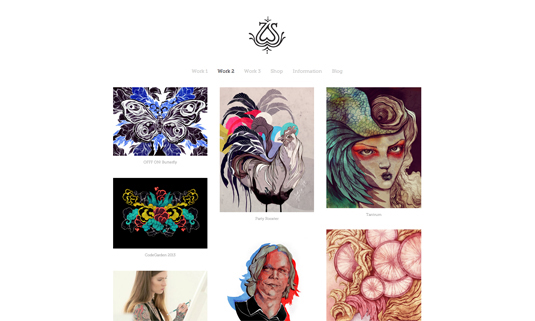
Having a clean and clear presentation will accentuate the work on display
The way you present your work is as important as the work you're presenting. Throw all your best projects together with no thought to breathing space on the page, and you end up with a chaotic mess.
Starting with easy to use templates, you can tweak how your work is shown with empty space offering breathing space for the eyes. Control the mood of your site with colours.
Use loud, brash colour combos, or subtle, neutral shades. Choose warm oranges and yellows, or cold greens and purples. There's no secret formula, so experiment and you'll soon work out the right combination for you. Our tip: Always choose simple over clever.
04. Get the basics right
Ensure your points of contact are clear and frequent within your folio. That means making it part of your site's navigation.
If you're freelance you might want to list your availability; or if you're looking for a permanent contract give an idea of areas and locations you're looking in.
Include client testimonials wherever you can. These show your potential clients or employers exactly what services they are buying into and whether you deliver the goods.
Try and include them next to the pieces within your folio, so a client can match a brief, the work, and the testimonial.
05. Portfolio in your pocket
You can carry your life's work in your pocket.
Instead of carrying around a physical portfolio of your work, or handing over an easily lost business card, show prospective clients your work on a tablet or smartphone. Head to your site, go to the most appropriate section for that client, and dazzle away!
With Squarespace, you get a free portfolio app for iPad and iPhone, and its responsive design means your website scales to look great on any device.
And the cool thing is that you don't need an internet connection, so you don't have to worry about getting a strong wifi connection. It's all there in the palm of your hand.
06. Be easy to find
People looking at your portfolio shouldn't be invite only. Your site will be found by search engines better if you have well-indexed pages. Give each area of your site a clear suffix that your navigation points at.
Categorise your work logically and include tags such as: home, work, contact, about, as well as a few other descriptions of the type of work you do.
For strong SEO, don't go tag- and category-crazy. Stick to no more than seven top-level categories and up to three tags per post.
The speed of your website can have a big influence on your search engine rankings. Google's Page Speed Tool is free, and provides great tips on how to improve the speed of your site. Some simple tweaks can make all the difference.
07. Brand you!
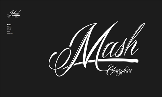
A logo is a must! Every designer, design studio or creative practice needs a logo that defines them, that gets in clients minds and stays there.
This could be your name in a favoured font, or some visuals that embody your work. Either way, ensure your logo is placed in the top quarter of your homepage, in an adjacent colour to your site for maximum standout.
Never made a logo before? Squarespace comes with a free pro logo maker.
08. Keep it fresh
There's nothing quite as unconvincing as a poorly updated portfolio. Keeping your portfolio fresh is essential. You keep your life's work online these days, but if you don't have your last killer piece on show, it can all count for nowt.
As well as updating your gallery, you could think about linking to a blog. A well-managed blog will develop your industry
standing and help you to build professional relationships with like-minded creatives.
However, running a successful blog takes time and effort. Updating it with relevant, engaging content and initiating discussion around posts can be time-consuming.
09. Bragging rights
Linking to work that's currently being used by a client instills trust in your new employer
Don't be modest! If you've worked for clients, make it clear. Keeping a freshly updated portfolio means you can even link to a piece of work that's currently being used by a client.
It shows you as a creative in demand, and eases the mind of employers not necessarily wanting to take a risk with an unknown quantity.
10. Get rid of the weakest link
A portfolio is sometimes judged, rightly or wrongly, by the weakest piece within it. And often, the piece you're most proud of, is not the best or most appropriate.
Group works clearly for relevance, but also get someone you trust to look over each and every piece you put online. There may be a silent stinker in there!
Ref: http://www.creativebloq.com/10-ways-create-great-first-impression-online-0


