 Back
BackThe 4 Universal Requirements For Great UX

As the saying goes, build the right thing, then build the thing right.
Usability is how well a product serves its purpose, and encompasses a variety of interface aspects: How functional is it? What's the learning curve? Is it overly complex? We can break down usability into a few core components, based on adefinition from Nielsen Norman Group, the prestigious UX consulting firm founded by Don Norman, Jakob Nielsen, and Bruce Tognazzini:
Learnable: A new user can easily figure out how to use the product for the first time.
Efficient: Users can accomplish tasks quickly and easily.
Forgiving: The design minimizes user errors. When errors are made, the design does not impose severe consequences and offers clear feedback for solutions.
Satisfying: The design is emotionally fulfilling.
Let’s look at some simple tips for designing the smooth experience your users need.
1. GREAT UX IS LEARNABLE
Learnability—that is, how easy it is to learn how to use a product—depends on context. Different industries have different standards.
For example, the money-sending app Venmo relies on simplicity and convenience, while Google Drive targets heavier workflows and offers a variety of features. The same user would expect almost instant learnability from Venmo, but needs more patient with Google Drive to learn actions such as sharing documents and managing permissions.
That said, there are common techniques that improve learnability in any scenario:
Use clear signifiers and UI patterns: Because they’re used repeatedly across diverse websites, signifiers (such as an envelope representing mail) and UI patterns are immediately recognized.
Design good empty states: Often seen as a placeholder screen, an empty statecommunicates what new users can expect from a page after they interact enough to populate it. More than just decoration, it helps users orient themselves immediately.
Use white space as a design tool: White space, or emptiness in the screen, can improve comprehension by up to 20% when used correctly. Placing ample space between elements and text creates breathing room, letting people pause to process what they’ve just seen.
Good onboarding: The onboarding phase is a golden window in which you show users the product’s core functions. Focus on the 20% of the features that users will need 80% of the time. Be concise, use plenty of visuals, and consider adding a completeness meter.
Progressive disclosure: Reveal information gradually instead of all at once, even giving users control so they can choose their pace. Progressive disclosure covers features such as content toggle (hiding/revealing more information), "more" or "expand" links, and instructional overlays.
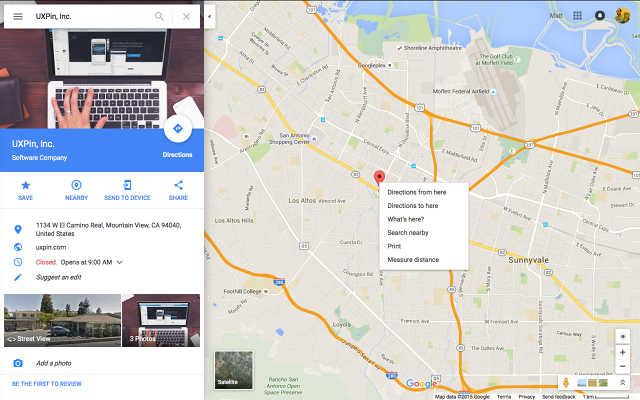
As a product that people use to get from point A to B, Google Maps has to be easy to grok. People won’t invest much time upfront to learn all the features, so the design must reveal additional functionality over repeated use. Luckily, you’ll find plenty of secondary menus in all of the right places.
In this case, onboarding isn’t actually necessary since the core task is so single-minded. People shouldn’t need a tutorial to explain how to find directions somewhere. The design must speak for itself. As a fallback, however, Google still includes a voluntary tour.
The most popular actions, such as finding directions, are visible, while secondary actions are left out of view until needed. The features are all easy to understand, thanks to clear icons (such as a star to suggest "favoriting" a location) accompanied by single-word labels. Notice the generous white space highlighting the location (in the search field and in a blue rectangle) as well as instantly understood UI patterns such as the pin on the map.
2. GREAT UX IS EFFICIENT
An efficient UX has two important components: one, you're streamlining how users reach their goal, and two, you're making the system feel efficient to the user.
Follow these guidelines to add both absolute and relative efficiency to your product:
Use color saturation to set visual hierarchy: Saturated colors are more vibrant and attract more attention, while desaturated colors have the opposite effect. As Anthony Tseng of UX Movement suggests, apply saturation to the elements you want seen (like CTAs, alerts, system messages) and desaturate colors in menus and panels to minimize distraction during core tasks.
Simple (not necessarily less) clicking: Some might think that every page should be accessible within three clicks of another. But this isn’t as accurate as people think. A better methodology is designing simple clicks with clear labels and navigation. As long as every click brings users closer to achieving their goals (and feels effortless), exceeding three clicks isn’t a problem.
Speed matters: Jakob Nielsen pointed out the importance of reaction times on a microscopic level. Don’t neglect site or app performance. Users only feel in control if reaction times are under 0.1 second. Users lose their feeling of control for delays exceeding 1 second.
Time users during testing: Time the completion of tasks during user testing. Usability expert Jeff Sauro offers some great advice for measuring and interpreting task efficiency.
Write out task flows: Make a list of each step it takes to complete a task, i.e., 1) open Gmail, 2) click "compose," 3) type recipient’s emails, etc. Review the list for redundancies and trim as many steps as you can.
Reorganize layouts: Rearrange the screen layout to minimize the number of distracting secondary elements so that only the elements related to the goal are visible.
Chunking: If you can’t get rid of certain content, try regrouping it. Chunking is an effective technique for reducing cognitive load without reducing the visible elements.
3. GREAT UX IS FORGIVING
For a good UX, the UI must be forgiving of user errors. Consider the following:
Undo vs. confirm: Popular opinion is that "undo" creates a smoother interface than confirmations about consequential actions, such as deleting. As Aza Raskinexplains, users develop a habit loop with pop-up windows, where it’s a habit to click "okay" before fully understanding what they’re confirming. An "undo" feature accounts for the habit loop instead of challenging it. There are some exceptions, namely when undoing is complicated, as with publishing something publically or for critical actions (such as deleting an entire email database).
Forgiving format for inputs: Input forms must accommodate multiple formats. The forgiving format UI pattern allows users to type in what they want, then sorts it out in the back end. Announce this feature through input hints, such as Yelp’s placeholder text, "tacos, cheap dinner, Max’s."
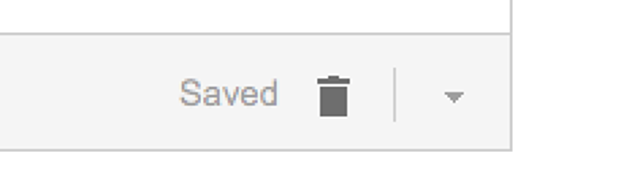
Autosaving: Cheap data storage makes autosaving great protection against users losing data, whether via human error or other accidents such as browser crashes or power outages. To maximize its effects, create a subtle indicator as Gmail does below—something that doesn’t require interaction, so not to distract.
Exceptional error feedback: You can’t defend against errors forever. When they do occur, provide feedback in a helpful way to get users back on track. Clearly explain what happened and how to rectify the situation, even providing a call-to-action for their next step. Just keep it succinct, as users will likely be skimming anyway.
4. GREAT UX IS SATISFYING
When we transfer Maslow’s hierarchy of needs into web design, functionality and usability form the base, while more abstract concepts such as satisfaction rise to the top.
A user’s enjoyment is nonetheless a large component of successful UX:
Microinteractions: The tiniest interactions add up to a cohesive experience. Microinteractions make the interface smooth and enjoyable. Adding a fun animation or surprising element makes using the system more intriguing and can even improve usability.
Meaningful gamification: Gamification gets a bad rap nowadays, but when done well it can enhance a user's experience. Steer away from tired ideas like badges and currencies, unless you have a new spin on them. Gamification works best as a way to remove interruptions. Show users their progress without patronizing them.
Personality: Interacting with a digital product should feel as human as possible. A banking app that feels like a friendly advisor works better than one that feels like a call center agent. Personality involves the tone of the copy, the visual styling, and the pace of the interactions. There’s no wrong answers as long as you build around your type of user. Start with user personalities (check their personas) before building your own.