The 3 Commandments of Great UX Design
When it comes to the Ten Commandments, there’s quite a few to remember. Talk about cognitive strain. Guess, Hick’s Law wasn’t much of a thing back in Biblical times.
For your convenience, we’ve narrowed down our list of commandments to just three. Yep, three. These are the three essential, non-negotiable elements for a great UX design. They can be used as a checklist for every UX project you do and shouldn’t be too hard to memorize.
Let’s get started.
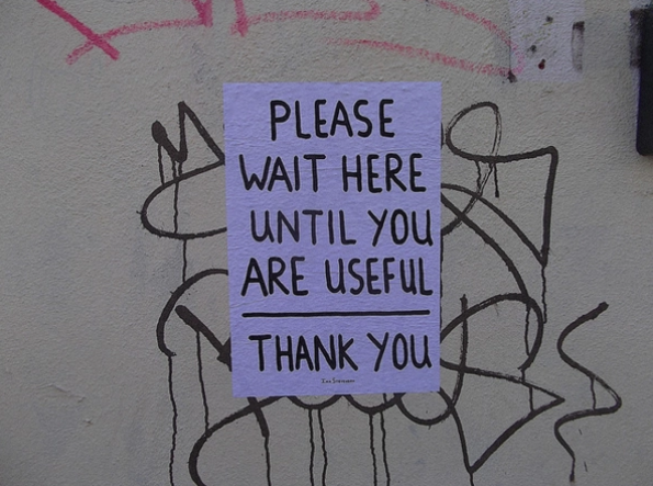
THOU SHALT BE USEFUL
The first and most important requirement: your product is actually useful. It doesn’t matter how usable or desirable it is if it doesn’t serve some purpose in your user’s life. In fact, studies placed usefulness at1.5 times as important as usability.
Like we first said in Web UI Best Practices, there shall be no other "gods" besides usefulness.
So, how do you define usefulness?
PAINKILLERS & VITAMINS
According to Jon Burgstone and Bill Murphy, Jr. in an article for Fast Company, customers buy products for two reasons:
- Easing pain
- Providing pleasure
However, customers will more readily invest in a product that alleviates pain than one that gives them pleasure, as Jon and Bill explain. That makes the products that ease a user’s life far more useful.
If you offer a service that no one else provides—or with features your competitors lack—customers will appreciate this more than if your product merely entertains (a product that does both is best, though, as we’ll explain later).
Designing a useful product relies a lot on knowing the problems your users face and how to solve them. The quickest route to this is usability research and testing, which we explore in-depth in our free e-book.Qualitative research like user interviews, surveys, or diary studies allow users to explain in their own words what’s bothering them. Whereas quantitative research, like analytics or A/B testing, will show you concretely where users are having difficulties and what their preferences are.
TEST FOR RELEVANCY WITH AN MVP
So how much product should you actually build to test your assumptions? The answer lies in the MVP (minimum viable product).
By starting small, gathering user feedback, and iterating incrementally, you ensure the product is always useful (e.g., relevant).
You can build an affordable MVP in several ways (for a more comprehensive list, check out this article):
- Create a landing page - Set up a landing page for the product concept you wish to test, explaining that customers will get an email when it’s ready. Run paid Adwords campaigns to drive traffic to the page, and then check how many visits and emails you capture.
- Plain manual labor – Nick Swinmurn, cofounder of Zappos, actually fronted the online retail giant before any infrastructure existed. He listed shoes for sale, then fulfilled them by buying the shoes locally and shipping them out. It required his full-time dedication, but certainly was a cheap and low-tech way of testing his idea.
- Start a fundraising campaign – Like we recommended in UX Design for Startups, sell the product before it exists. If you get enough funding on Kickstarter or Indiegogo, that’s a strong signal that your product is probably quite relevant for people’s lives. As you build the product, keep in touch with your supporters for feedback and ideas.
For example, take a look at how Buffer went from an idea to a profitable product in 7 weeks. Joel Gascoigne started with an idea for a social media scheduling app.
Following the principles of Eric Ries’s lean startup, his first step was a drastically minimum release to test user interest: a landing page with a call-to-action that explain what the app did (under the pretense that it already existed). If users clicked the call-to-action, they were taken to another apologetic page explaining they were still putting the "finishing touches" on it.
With those emails, Joel personally contacted those "earlyvangelists" for their feedback and ideas in shaping the product. As it turned out, the response was positive enough that Gascoigne went forward to actually build the app. But the takeaway from his story is that—before even an ounce of heavy design work—he made sure his product was useful.
And useful it is—as of June 2015, the company currently rakes in $6.4 million per year (and growing).
THOU SHALT BE USABLE
So, you have a product that solves someone’s problem. Take a moment to pat yourself on the back, but no more than a moment—there’s still a lot of work ahead of you. As the saying goes, build the right thing, then build the thing right.
Usability is how well the product performs at serving its purpose. It refers to the quality of the user’s experience using a product—naturally of particular interest to UX professionals. This encompasses a variety of elements, from function to learning curve, to overall complexity.
 Flickr user Kristian Bjornard
The Nielsen Norman Group defines five core components to usability:
- Learnability - The ease with which the user can figure out how to use the product for the first time.
- Efficiency - The ease with which users can accomplish tasks.
- Memorability - How well a user can recall the system after a period without using it.
- Errors - The amount and severity of errors both from the system and the user.
- Satisfaction - The pleasure a user gets from using the product.
With the exception of Satisfaction (which is a commandment all its own), these factors are all pretty mechanical. Usability is the nitty-gritty of design, where you roll up your sleeves and smooth everything out.
As with usefulness, you shouldn’t just go in blindly to create a system you think your users will like. Your design’s usability should be determined through more reliable and structured methods, and involve the users themselves.
Based on what we do at UXPin, this is the method we find most effective:
1. Wireframe. This is the preliminary stage of the design, where you solidify the structure, layout, and information architecture. It’s important to set aside time for only these details, instead of lumping them together with more meticulous graphics and interface decisions.
The wireframe is the skeleton. Wireframing helps you start addressing efficiency since you’ll need to prioritize what goes where. Some designers may even want to go more basic. Sketching out your ideas can help flesh them out even before the wireframing phrase.
We’re big supporters of testing products as much as possible, at every iteration. As a next step, we’ll add some interactions in our tool for a quick prototype we can test with users.
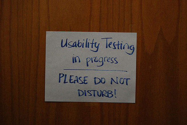
2. Prototype and test. Build a workable prototype, then test it with at least five users. Even if your prototype is rough, you should be able to test for all usability factors except for satisfaction.
 Flickr user Aaron Fulkerson
For testing, elicit both quantitative and qualitative feedback. Observing how users complete tasks, and how long it takes, will cover quantitative data—you can count the number of clicks or pages visited. As users run through the app, encourage them to think aloud and record their qualitative feedback.
3. Continue prototyping until ready. The cycle of rapid prototyping is design, test, implement feedback, and start the cycle over. You’ll want to repeat step 2 over and over again until your product is getting excellent feedback. The idea is to build and test progressively better and/or more elaborate prototypes until you have something that resembles your final product.
THOU SHALT BE ENJOYABLE
In a post for Treehouse Blog, Aarron Walter equated psychologist Abraham Maslow’s famous hierarchy of human needs to web design.
The bottom of the pyramid, the fundamentals of human life such as food and shelter, were represented by factors like functionality and usability. The top, more intangible factors like esteem and actualization, were represented by delightful design.
Make no mistake about it—delight is not as important as usability, which itself is not as important as usefulness. But since we’re talking about great UX design, your product definitely needs all three.
THE POWER OF DELIGHT
What we mean by delight, enjoyability, and desirability is that certain "X factor," that keeps people coming back. Stefan Klocek calls it a "passive magic," when everything feels so intuitive and effortless. As the most abstract of the three elements listed here, this might be the hardest to apply. But the rewards are great enough to put in the effort to figuring out how.
As Don Norman points out, humans are not the logical creatures we think we are. Studies have shown that emotional responses are one of the most important determiners in how we make decisions—often surpassing logic. He explains this is for biological reasons, as our ancestors needed to make split-second life-or-death decisions in the wild; but whatever the reason, that’s how we’re programmed today.
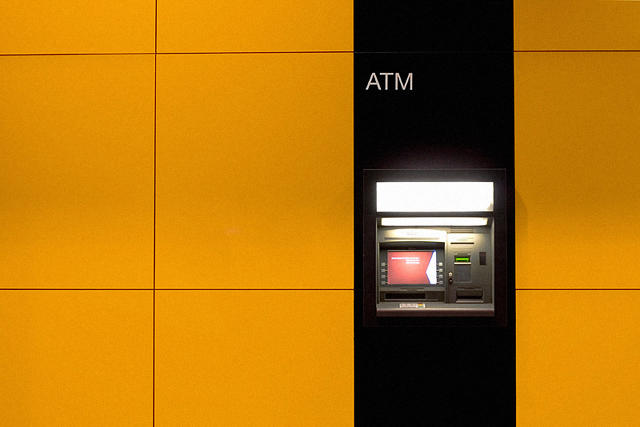
Perhaps this explains why another study by Masaaki Kurosu and Kaori Kashimura showed that users perceive more pleasing products as more usable. These researchers tested two ATMs that functioned identically. Testers cited the attractive ATM as actually working better, meaning a delightful design can, in a way, improve usability.
Don Norman explains that when users are enjoying themselves, they’re more relaxed, and when the brain is relaxed, it functions better overall. This means learning new concepts, recalling past data, even motor skills occur more fluidly.
ELEMENTS OF DELIGHT
Explaining why it’s important is the easy part. Explaining how to improve yours is more difficult. Dr. Charles B. Kreitzberg recommends engaging the user with stimulating visuals. Certainly aesthetics have a lot to do with desirability, though they aren’t the only consideration.
As explained in Interaction Design Best Practices, small gifts and discoverables will also engage your users. A reward-based system can help generate trust and build a relationship. At the same time, small discoverables like a quirky error message or a surprise animation (that communicates meaning) can also keep your users interested.
Desirability can be tested right alongside of usability, with a few select questions during the post-test interview. In fact, Microsoft even has their own downloadable Desirability Toolkit, with information and examples to help you get started.
APPLYING THE 3 COMMANDMENTS
The language learning site Duolingo applies all three of our commandments in an exemplary way. Browse the site, and you’ll see what we’re talking about in action.
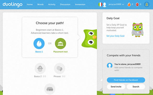
For starters, the idea is useful. Almost everyone wants to learn another language, but only a fraction of those actually put in the effort. That’s why a free site with a game-like mechanism for teaching is such a good idea—it seems like a cheaper and more fun alternative to more traditional language-learning methods.
For usability, Duolingo has to deliver what it promises—an efficient method of studying another language. Their language games distract from the fact that users are actually learning something. Features like timed quizzes and progression checks help move the user along their journey.
Last, the site is enjoyable (which, in this particular case, is synonymous with usability). However, even outside the learning elements, Duolingo goes above and beyond to provide a satisfying experience. An array of colors and a cartoonish environment—complete with owl mascot—make visiting the site pleasing, not to mention actually using it.
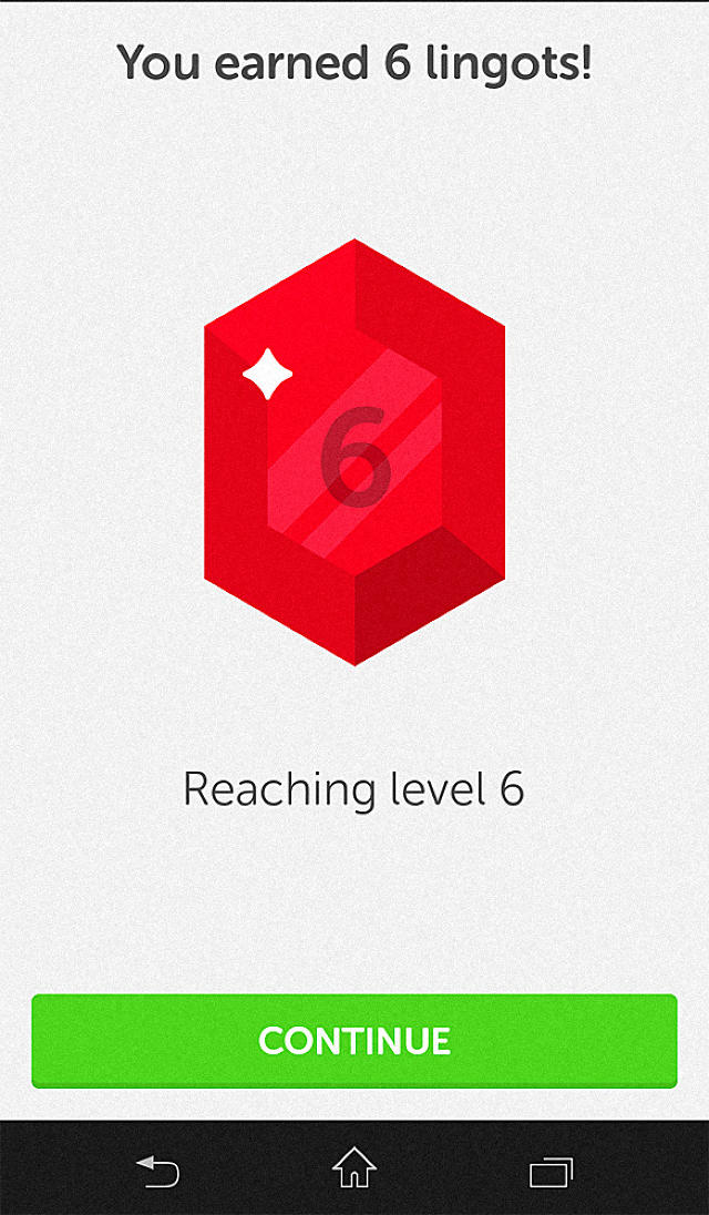
The "lingot" system also demonstrates that something extra. Users earn lingots through completing language-learning tasks, like in-app currency. Lingots can later be exchanged for new features, such as more options for testing your skills. This encourages interaction and engagement, deepening the user’s investment with the site.
By drawing on all three of the great UX design commandments, Duolingo and other sites earn the advantage over their competitors by giving their users something more.
It starts with an idea, a useful service that’s lacking in your users’ lives. Then comes an interface that’s as effective as it is understandable, making the product easily usable. Last comes the icing on the cake, the little extra features that lend a magic to the product, making it enjoyable.