

 Back
The Body Shop Returns the Pod to Its Packaging
Together Design London has redesigned The Body Shop's iconic Body Butter and wider Bath & Body portfolio, reconnecting the brand with its visual heritage by putting the Pod back at the heart of the design.

The Body Shop‘s signature Body Butter range, first introduced in 1992, has recently undergone a wider relaunch. With the products themselves revisited for a new generation of consumers, Together Design London was challenged with finding a meaningful expression for them on-pack. The goal was to recapture the character and distinctiveness associated with the brand while creating a coherent design system for today.

Before-and-after comparison showing the visual redesign of The Body Shop’s Shea Body Butter container.
At the heart of the new solution is the Pod, an iconic graphic asset from The Body Shop’s history rooted in ideas of nature, growth and positive change. The agency saw an opportunity to bring this familiar brand equity back into focus.
Balancing consistency and individuality
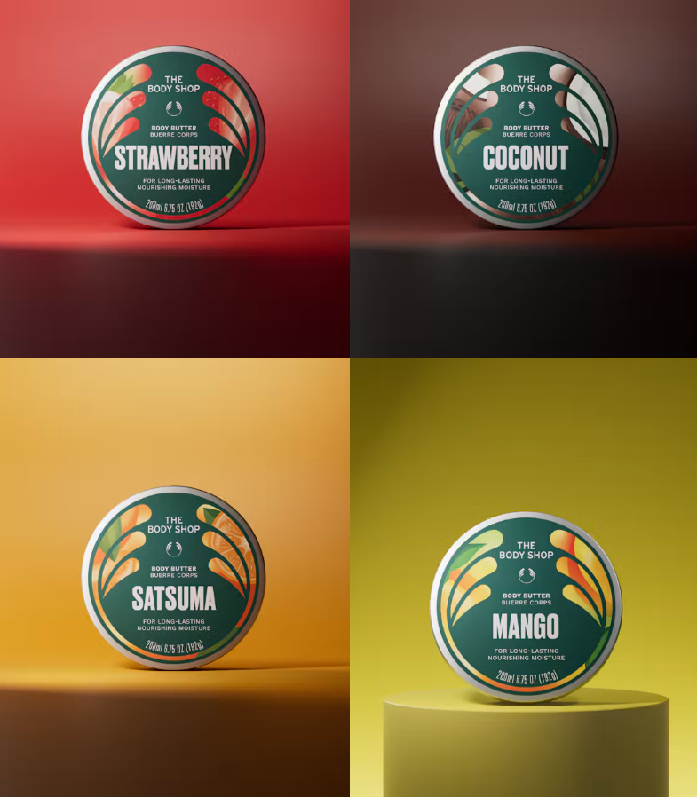
The Pod was elevated from a supporting brand device to become the central organising principle of the packaging. Set against The Body Shop’s heritage green – a colour that traces back to Anita Roddick’s original Brighton store – it creates a strong, recognisable silhouette across the range.
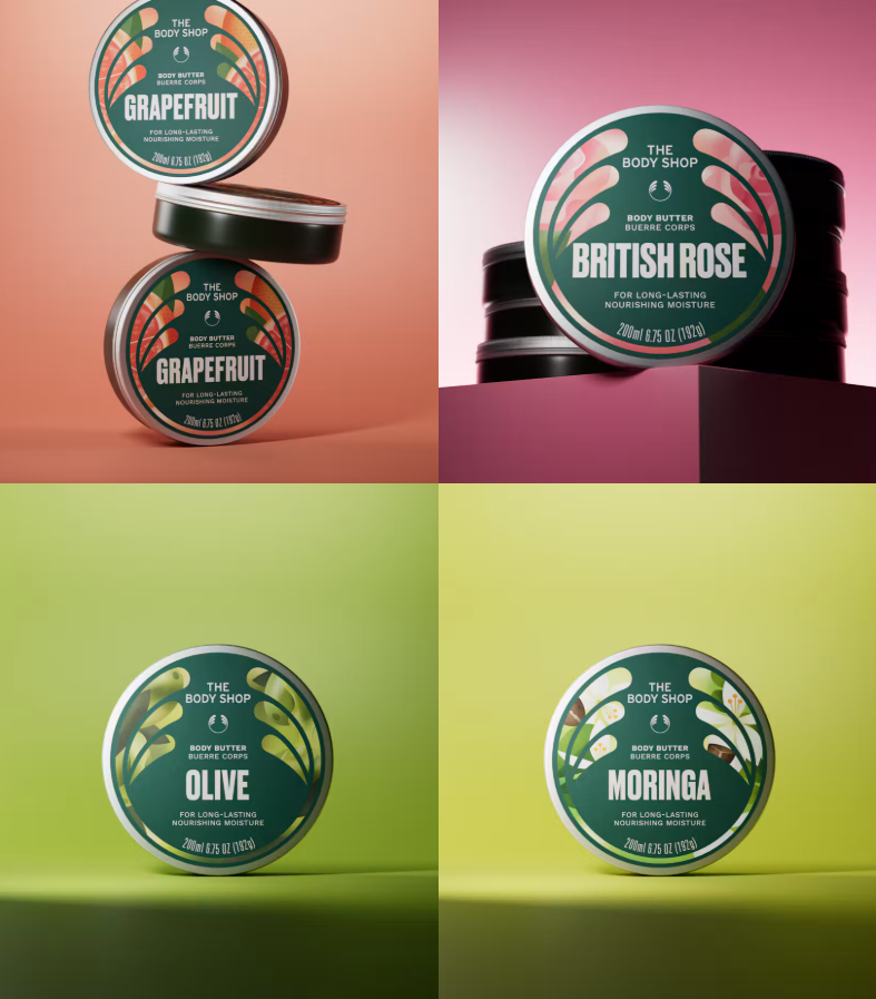
Inside the Pod, expressive ingredient illustrations by Sally Caulwell bring a different energy to the system. Rich, colourful and deliberately sensorial, these illustrations celebrate the ingredients, fragrances and indulgence associated with Body Butter, giving each product its own personality. Balancing the consistency of the Pod with the individuality and appetite appeal of each product became central to the design.
Stretching across a complex portfolio
One of the biggest challenges for the agency was scale. The design needed to work across not just a single hero product, but the Body Butters and a much broader Bath & Body portfolio with different formats, product names and ingredients.
‘[Having been] a loyal Satsuma customer in my teenage years, we were delighted by the opportunity to look at The Body Shop’s incredible visual history and ask what was already there that deserved to be celebrated again,’ said Bryony Meyrick, creative director and co-founder of Together Design London.
‘The Pod always stood for such a positive and empowering message; we wanted to bring that piece of equity back and give it a much more confident role. The real design challenge was turning that idea into a system that could stretch across such a large and varied portfolio. The more we spoke to people, we realised everyone had their favourite scent or association with the brand, so it was about getting the balance right, making every product feel individual and sensorial, while ensuring the range felt familiar and unmistakably The Body Shop.’
Victor Sabbe, chief marketing officer at The Body Shop, said: ‘Body Butter is our number one bestseller and one of The Body Shop’s most classic products, so as we redeveloped the product following consumer requests for a more buttery, sensorial formula, we wanted the design to signal that same evolution. The ambition was to reconnect it with what makes The Body Shop distinctive: ethically sourced ingredients, the power of nature and joyful sensoriality.
‘Bringing our signature Pod back to the heart of the pack allowed us to express nature in a more contemporary, energetic way, ingredients growing almost rebelliously within it, as only nature can. The result feels unmistakably The Body Shop: rooted in our heritage, but with a bolder, more modern expression for the next generation.’
The result is a design system that aims to feel both familiar and fresh, creating greater impact, consistency and navigation across an extensive portfolio. Together Design London is currently working with The Body Shop on further ranges due to launch throughout 2027 and 2028.
Source: Design Week