Pentagram Gives Tea A Sophisticated, New Look
Bringing tea leaves to market involves a drawn-out process of auctioneers, agents, and wholesalers. But Teabox, an Indian company backed by a Texas billionaire, strips out the middlemen to ship its premium leaves to consumers within 48 hours of production—light years faster than the traditional three to six months. To communicate its innovative approach and help it compete in the $40 billion tea industry, Teabox enlisted Pentagram partner Natasha Jen to conceive of a forward-thinking identity.
 "Tea as an industry and as a branded commodity is an incredibly traditional—if not antiquated—field," Jen says. "If you look around, you’d notice that the majority of the messaging—verbal and visual—are still imprisoned in either colonial or new-age kind of tropes. By being colonial it suggests heritage and luxury. By being new-age it suggests the health aspect and relaxation of tea-drinking."
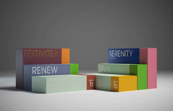
Working with with Teabox founder Kaushal Dugar and marketing director Rohan Jahagirdar, Jen created an identity that was vibrant, sophisticated, modern, and let the product shine. She and her team viewed the identity as a kit of parts that could grow along with the brand. "The elements are in fact incredibly simple and work in concert to suggest a new outlook to tea drinking," Jen says.
 The identity was built around a custom typeface and monogram that riffs on stencils traditionally used on tea crates. "We wanted to question the typical revivalist approach by creating a mechanized yet colorful and playful canvas," Jen says. "The only element that has a traditional lineage to it is the customized stencil typeface: stencil typefaces are commonly used on tea shipping crates throughout centuries and are still in use today. But when the stencil typeface is combined with a deliberately clean canvas, it creates an entirely new look and feel."
The packaging features two bold colors, one that's commonly associated with the tea—green for green tea, orange for Chai, etc.—and a contrasting hue. Elegantly embossed, the boxes celebrate their contents—there's a bit of ceremony sliding one open to reveal the metal tin nestled inside.
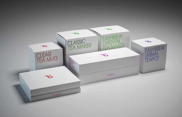
Leaflets accompany each box of tea leaves and feature instructions on how to properly brew them, tasting notes (a la the wine industry), and detailed background on the tea itself. To streamline the information, Jen's team created custom icons.
 "Teabox is global—its customers are from all regions in the world—and its effort in rebranding, and our work, aimed to speak to the larger global tea community that’s very much used to seeing nostalgic design," Jen says. "We hoped that by introducing an essentialized and playful look and feel, it’d create a new kind of experience and a new lens to tea making, a centuries-old practice."
Around the world, water is the only thing people drink more of than tea. In the United States it's a smaller market compared with heavyweights like China and Russia, but the luxurification of the product is steadily underway. For example, Samovar, in San Francisco,aspires to be "the Apple Store" of tea purveyors. Matcha is having a moment in NYC. With its stunning identity, Teabox is poised to make a splash in the industry.